
Rebranding UTS Holding Of Africa

UTS Holding of Africa initiated a major strategic transformation: shifting from a multi-business group to a structured, clearly defined holding company ready for pan-African expansion. This shift required a full rebrand ; a new identity for the holding, the repositioning of seven subsidiary brands, and a digital ecosystem capable of supporting the group’s international ambitions. Grande Charte Digital was commissioned to lead the transformation end-to-end: brand architecture, corporate design, visual identities for all subsidiaries, and custom development of the entire web platform ecosystem.
Design d'identité
UI & UX Design
Digital Strategy
Wordpress
UTS Group was experiencing a dilution of its market positioning. The company operated several heterogeneous business lines under a single banner, which blurred the clarity of its offering and limited its ability to present itself as a structured, credible player to industrial and institutional partners. Transitioning to a holding model enabled the group to clarify its strategic leadership, structure its growth, and establish a clear and coherent framework for each business unit.
Rebranding & Visual Identity
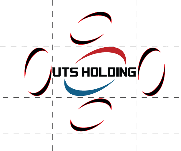
The rebrand of UTS Holding focused on elevating a long-standing identity toward a more mature, corporate visual standard. The former logo (visually heavy and no longer suited to modern usage) was fully redesigned to project an image that is international, refined, and structurally robust. The final design is built on cleaner lines, stronger typography, and a strategic use of the group’s foundational colors, giving UTS Holding a clear institutional presence aligned with its pan-African ambitions. This new visual identity now serves as the backbone for several subsidiaries, each benefiting from a unique declination that remains aligned with the renewed stature of the holding.
UX/UI Design & Custom Web Development
All websites were developed in WordPress using a clean, controlled, performance-driven approach. No unnecessary plugin stacking ; every essential feature was custom-built or properly integrated to ensure fast, stable, secure, and genuinely SEO-friendly platforms. As an extension of the rebranding effort, we designed and developed seven distinct websites, each conceived as the sovereign digital showcase of its respective business unit. The goal: provide every subsidiary with a tailored, credible platform aligned with its operational positioning, while maintaining a coherent ecosystem at the group level.






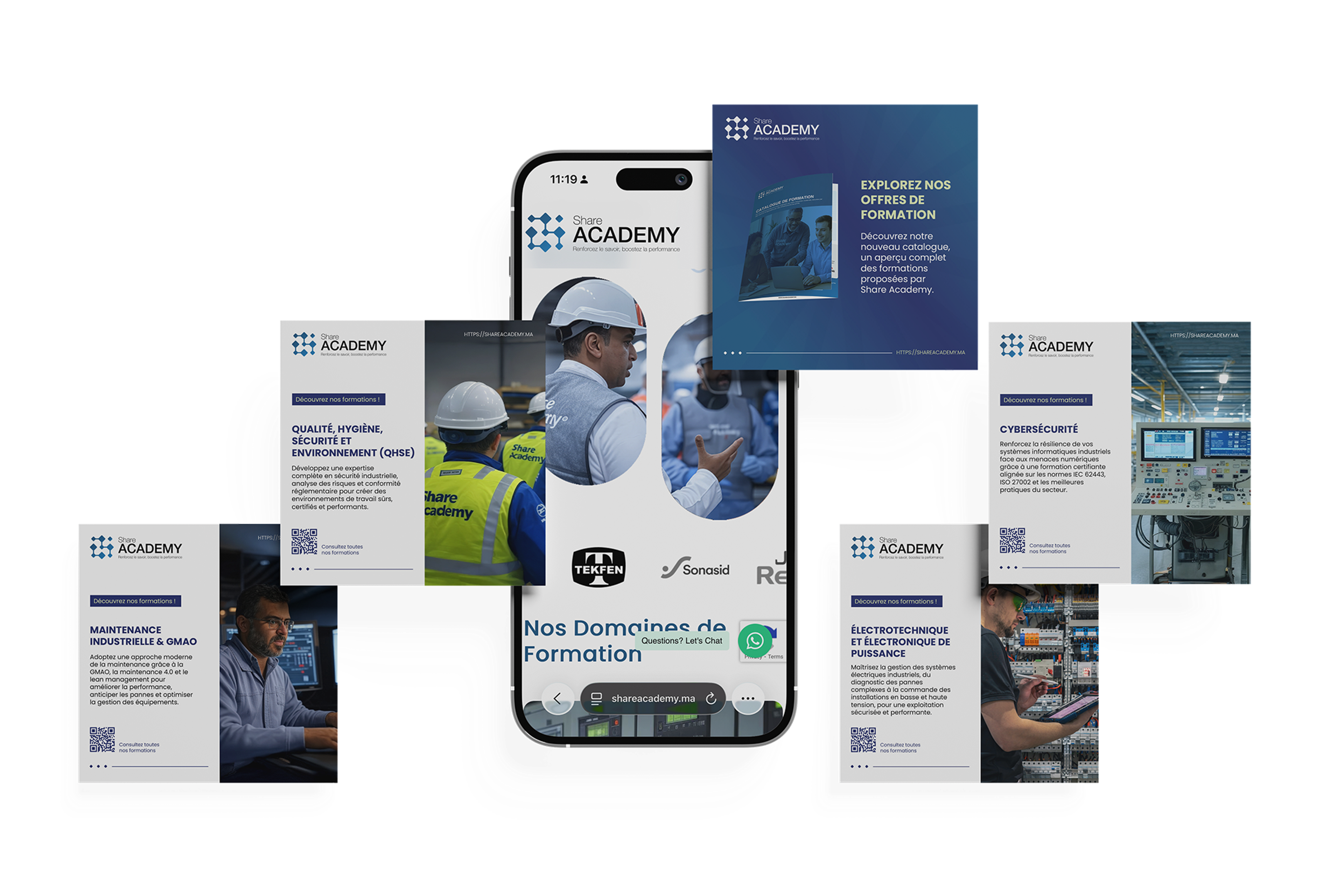
Shareacademy.ma
Share Academy becomes the dedicated branch for upskilling and professional development in industrial sectors. The goal was to give it a credible, structured, and professional identity able to reflect the quality of its training programs and its key role in developing talent within the industry. The positioning is built on a modern, educational visual language that reinforces its commitment to operational excellence.
AISP.MA
With AISP, the priority was to create a strong, expert-driven brand in a highly sensitive field: cybersecurity. The identity combines rigor, trust, and technical depth, positioning the entity as a strategic partner for organizations seeking to secure their critical infrastructures.
Social Media Campaigns for Shareacademy.ma
To support its launch, we developed a social media presence focused on pedagogy and technical credibility. The goal was to position Share Academy as a reference in industrial training, strengthen its visibility among professionals, and reach individuals seeking career advancement. The content strategy highlights the programs, the instructors, and the operational value of the skills being taught.